OMDB
log in

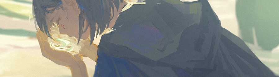
love solfege - Land Art by Chromasia

Mapset info
Ranked: Jun 17th, 2024
Average Rating: 3.55 / 5.00 from 20 votes
Japanese Pop
Nominators
dakiwii melleganol


Rating Distribution
Rating: 2.78 / 5.00 from 20 votes
Ranking: #277 for 2024, #4116 overall
precision, marathon, featured artist
Log in to rate maps!

separate your tags with commas

Latest Ratings
Kataryn
on Blank Canvas
2mo ago
danissima
on Blank Canvas
2mo ago
Emiya Nikita
on Blank Canvas
2mo ago
Deca
on Blank Canvas
3mo ago
toybot
on Blank Canvas
3mo ago
EnuHQ
on Blank Canvas
3mo ago
Melter
on Blank Canvas
3mo ago
dakiwii
on Blank Canvas
3mo ago
yuakka
on Blank Canvas
3mo ago
rHO
on Blank Canvas
3mo ago
quantumvortex
on Blank Canvas
3mo ago
catwords
on Blank Canvas
3mo ago
getenrou
on Blank Canvas
3mo ago
piklopedia
on Blank Canvas
3mo ago
amongusrtx30080
on Blank Canvas
3mo ago
Mijii
on Blank Canvas
3mo ago
GalaxyGaming
on Blank Canvas
3mo ago
Castiello
on Blank Canvas
3mo ago

Featured on lists
Comments (9)
3mo ago

brigading is pretty cringe but map's ok

3mo ago

good song
1/8 extends incredibly cringe
pretty good otherwise, very pishifat

3mo ago

1) A really consistent map and I like that. However, the number of ideas represented could be bigger. A lot of patterns (including streams which are the main thing of the map) repeat too many times. I wish less streams were based on geometrical shapes (e.g., circles) in order to be cooler. It’s too hard to maintain making cool and creative patterns when you base them around geometry. I wish there were more streams like 03:06:661 (2,3,1,2,3,1,2,3,4,5), 03:25:336 (1,2,3,4,5,6,7), 03:26:536 (1,2,3,4,5,6,7) etc and also more wiggle streams or streams that overlap themselves. The streams I’ve mentioned are really nice and I’m sure you are able to do more of such. Same point about geometry goes with other patterns. As I think, it would be much better if there were less patterns like 01:40:495 (2,3,4,1,2,3,4). Coming up with ideas besides copying a certain slider is crucial (same with streams, a lot of them just represent a curved or a straight line).
2) I appreciate the colorhax you’ve made. Also, the idea of making the first half of the map colorless and then bursting with colors in the kiai is amazing. Not many people can come up with that, I think, and not many teams colorhaxed their entries in the first place. However, color usage could be definitely better. For this “bursting” effect being more dramatic, you should’ve chosen brighter colors. The first half is dense and loud enough to have it emphasized with white and gray, you could’ve used some light brown maybe or a similar neutral color. Also in the hardparts you could’ve made a part where more than 2 colors are being used (e.g. blue, red, yellow and white). 5/110

3mo ago

hoooooly shit chromasia ranked

3mo ago

White Canvas

3mo ago

5/110

3mo ago

creative I give it a 5/110

3mo ago

1) A really consistent map and I like that. However, the number of ideas represented could be bigger. A lot of patterns (including streams which are the main thing of the map) repeat too many times. I wish less streams were based on geometrical shapes (e.g., circles) in order to be cooler. It’s too hard to maintain making cool and creative patterns when you base them around geometry. I wish there were more streams like 03:06:661 (2,3,1,2,3,1,2,3,4,5), 03:25:336 (1,2,3,4,5,6,7), 03:26:536 (1,2,3,4,5,6,7) etc and also more wiggle streams or streams that overlap themselves. The streams I’ve mentioned are really nice and I’m sure you are able to do more of such. Same point about geometry goes with other patterns. As I think, it would be much better if there were less patterns like 01:40:495 (2,3,4,1,2,3,4). Coming up with ideas besides copying a certain slider is crucial (same with streams, a lot of them just represent a curved or a straight line).
2) I appreciate the colorhax you’ve made. Also, the idea of making the first half of the map colorless and then bursting with colors in the kiai is amazing. Not many people can come up with that, I think, and not many teams colorhaxed their entries in the first place. However, color usage could be definitely better. For this “bursting” effect being more dramatic, you should’ve chosen brighter colors. The first half is dense and loud enough to have it emphasized with white and gray, you could’ve used some light brown maybe or a similar neutral color. Also in the hardparts you could’ve made a part where more than 2 colors are being used (e.g. blue, red, yellow and white). 5/110

3mo ago

my goat goated so hard

rules | discord | descriptors | edit queue | project legacy
0.070008993148804s